From color palettes to insect iconography and outdoor imagery, the bug spray category follows a well defined path. With such opportunity to break new ground, we were excited when asked to reimagine how the category could look and feel.
Tasked with breaking outside the predefined notions, we created a variety of brand and packaging concepts that bring a sense of humor and light touch to the category. Clean, bright and modern, the concepts shown below demonstrate two approaches on how to create a new aesthetic for insect repellant and deliver a distinct, memorable brand on shelf and at home.
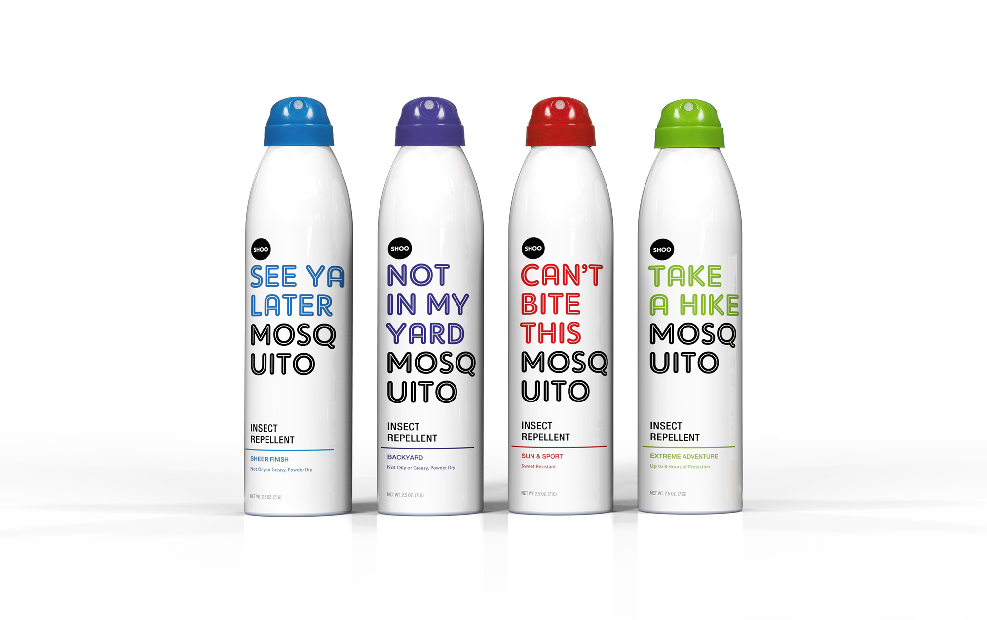
Shoo
Our first concept pairs a fun, sassy tone with simple type treatment to create a clean, no-holds-barred entry into the bug spray catalog. From the brand, Shoo, to the product names, this concept lays out the product use case and benefits in no uncertain terms. In a sea of greens and blues, the bright, white can and large, colorful type help this concept pop on shelf and draw shoppers in from a distance.
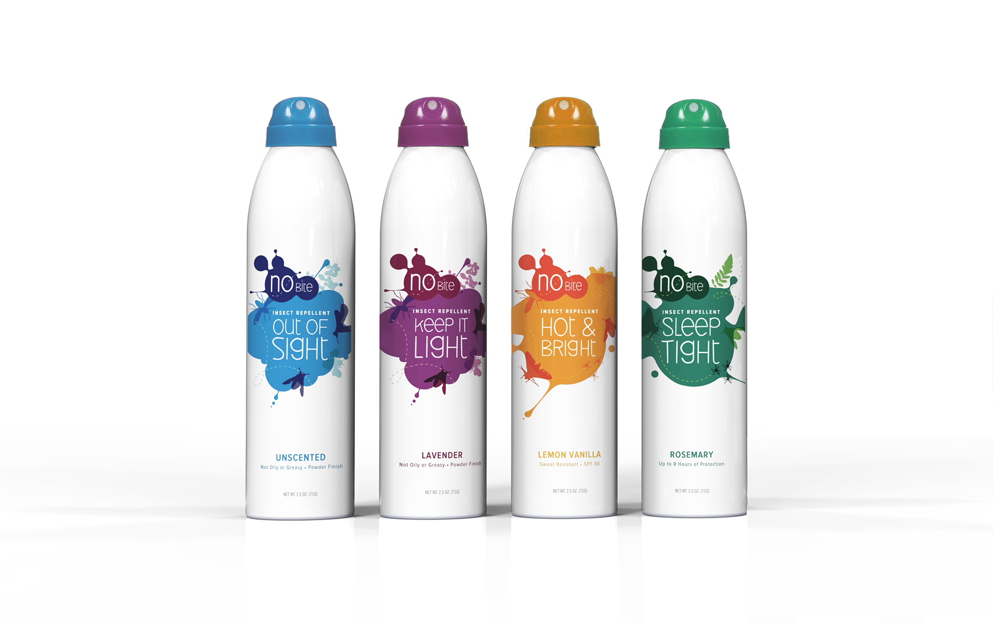
No Bites
A softer approach than concept 1, No Bites keeps the clean, white can, but uses a more sophisticated illustration style to stand out on shelf. This concept also uses scent as a key differentiator in category, using aromatic plants and flowers with natural bug repelling qualities to replace the typical chemical smell. Together, it creates a high-end, refined feel for the brand that elevates bug spray from the realm of backyard barbecues to dining al fresco.